The art and practice of interior design is just that. An art that is practiced. Anyone can achieve their dreams for their home with a little patience and practice. I am going to guide you through the basics to get you started, or, if you prefer I can offer more advanced and specialized advice and guidance.
Basic Tips To Get You Started
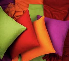
I have put together some basics steps to help with your new space for the everyday designer. Weather your inspiration is a pillow, a scrape of fabric, a special color or just an idea I can some simple steps can get you going. Included are some of the secrets professional designers don't want you to know. I will mark these with an * Please read through the basic steps before moving into the more advanced project pages.
Budget
Before you do anything decide on a budget. Give yourself a bottom line and stick to it. It does not always need to be expensive to make significant changes to your space. The better planned the budget the smoother your project will go.
Smaller Budgets:
1. Paint is an easy way to create a new feeling to a space.
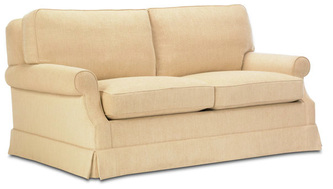
2. Spruce up the sofa with a slipcover and some new pillows.
3.Rearrange the furniture
4. Add an area rug
5.Rearrange or purchase new accessories
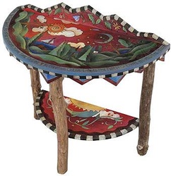
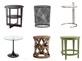
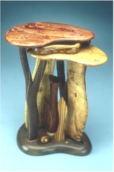
6. For furniture a couple of new accent pieces, coffee table, side table, or lamps, can make a big difference
Larger Budgets:
1. Focus your budget on the main pieces of your interior, furniture, window coverings and any art work.
2. Work down from professional services to upholstered pieces(fabrics) to window treatments to floor coverings to paint and lighting. Accessories should be last in priority because they can always be added later.
*Remember a project can always be completed in steps. Start with the backgrounds and main pieces and go from there as your budget allows.
Get Started
1. Start a file
A box, a folder or whatever to hold information.
2. Pictures*
Go through magazines, books, internet or any source and tear, mark or download anything that you like. Don't think too much about why you like it. Their could be a feeling, a style, a color, the architecture, the furniture, a lamp anything that catches your eye.
3. Color
Hit the paint center and go through the paint chips. Again pick any color you like. Collect several samples. Add them to your file.
4. Fabric*
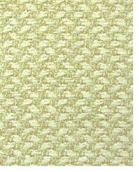
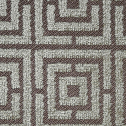
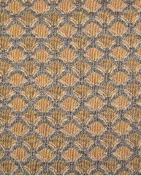
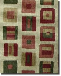
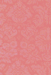
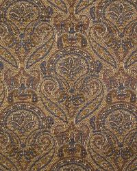
Put together some samples. Don't worry about color. You're looking for texture and pattern only. Make note of large patterns and short repeat patterns.
5. Notes*
Makes notes of any and all ideas you have. They don't have to have any pattern, but do try to organize them into categories.
* One important note I would like to make. When starting a new project please do not start with draperies. You will end up trying to coordinate everything else to them. If you are just doing a little update you can start with drapes to enhance what you already have. I suggest you start with the upholstered pieces and move on from there.
.
A few words about style:
Again style is up to you. Remember you’ll end up with a space much more comfortable to you if you go with your instincts and feelings. Go with what you like. Following these guidelines will help you get the space you desire and love.
Again style is up to you. Remember you’ll end up with a space much more comfortable to you if you go with your instincts and feelings. Go with what you like. Following these guidelines will help you get the space you desire and love.
ORGANIZATION
I have included some images below to help illustrate the topics listed. Check the surfaces and accent pages for more examples.
Grab your file and spread everything out in front of you. Take notes as we move through these steps.
Start with the pictures. Look for commonalities in color, furniture styles, fabric patterns ect. Look also for the intensity of light or dark in the lighting. Are the spaces open or more cozy? Look for textures of metal, wood, fabric, ect. Note is there shine or more of a matte finish. What about the architectural features. You should start to see some patterns to what you like. You should be able to see a style developing here.(traditional, modern,contemporary,transitional)Set these aside.
A word about style. Don't worry about being correct with a certain type or style of design. The goal here is to achieve a personal, comfortable and attractive space.
Now get your color samples and check against the pictures to see if there are any matches or similarities and set these aside. Now pick out the colors that really attract you and set these aside the others you just picked. Now look at the two sets of colors and look for any combinations that you feel work together. Be sure there are some neutrals in the sets.
*NOTE* Any colors will go together as long as they are of the same tone(cool or warm) and I mean any colors. Retailers generally arrange the samples in this way.
Separate the neutral colors from the others. Neutrals will generally be used for background or base colors.
Pick your favorite two or three colors to use as accent colors. We will talk about integrating your colors a little later.
You can mark the chips ect. with their category to help keep them organized.
Next Step: Fabric
Look at your samples. Ignore the colors for now. Decide which textures and patterns you like and set them aside. Remember the feel of the fabric is just as important as the look and color.
Decide what is important to you in a fabric and what its use is going to be. Do you need durable upholstery for a sofa? Are your throw pillows going to see a lot of use? Are you planning on having some pillows or upholstered pieces more for looks? Keep in mind the differences between natural and synthetic fabrics as described below. All types of fabrics are available in both natural and synthetic weaves. Both have their good point and bad points. Below is more detailed information about both.
Natural fabrics: tend to be more comfortable and breathable, but can be, but not always, more expensive.
Wool; wool is one of the most durable long lasting and easy to clean fabrics. It is available in all variety of textures and styles, but can be expensive.
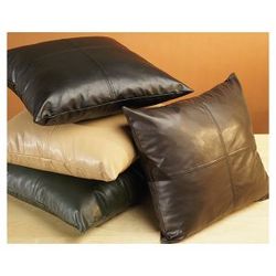
Leather; leather can be confusing. Natural hide is durable but is not easy to clean and will stain, but, the lower grades with surface finishing in cleaned with little effort. Also stay away from split hide furniture.(almost always the least expensive) It tends to be hot or cold and has a tendency to crack over time. By all means feel safe in mixed hide pieces.(split hide on the sides and back) These last much longer. Good leather pieces can last for twenty or thirty years.
Suede; is very durable, but alas, is not practical. Suede is easily stained and can not be cleaned. It is best used as accent fabric or a wall covering. Synthetic suede is an alternative.(see synthetic fabrics) They stain easy and are also unclean-able. Using them as trims on upholstered pieces or pillows is a way to add a touch of luxury without to much worry.
Cotton; is the most versatile of all fabrics. Durable and most can be cleaned without to much effort. Cotton is available in a wide variety of textures and weaves.
Silks and Satins; This group of fabrics are desirable for a look of luxury but have several drawbacks. Their best uses are for accent pillows, drapes and outer bed linens
Synthetic Fabrics: tend to be more affordable and durable but can have some drawbacks. Most common are polyester and poly blends. Almost all synthetic fabrics are one of these.
Polyester; is made from petrol chemicals. Is the most affordable. Can be very hot in warm climates because of very low breathablity. Claening is very easy in almost any application.
Patterns and Textures:
Texture and pattern is a great way to add interest to your overall design. (remember the heavier the texture the harder it is to clean)
The level of texture and pattern you use is a personal choice. Modern styles tend to use a lot of texture as a main element and pattern as an accent. Traditional styles tend to use both texture and pattern more heavily.
Collection of Samples
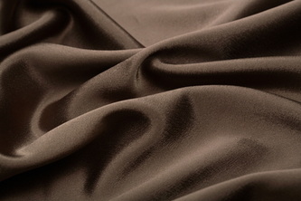
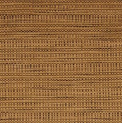
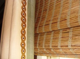
Some Examples of Texture
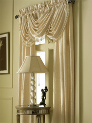
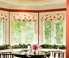
Window Treatments
*This is an area I suggest contacting me for some professional advice.
*Never start a project with window treatments. You will end up trying to coordinate everything to them......
Your windows are a important part of any room. Pay extra attention to the “public” spaces in your home. If cost is an issue, spend on these spaces and cut back in the others.
Color is tricky with window treatments. The amount of color used is very subjective. You want your windows to be part of your design without standing out to much or disappearing into the background. Think of them as a mild or slight accent. You want them to blend in and not be a focal point.
Unfortunately the rules for window dressing are not cut and dry. Factors include, size of windows, style of the interior design, how many windows in space, and light or protection needs.
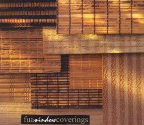
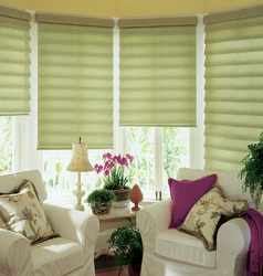
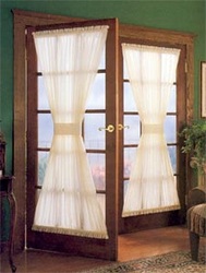
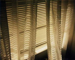
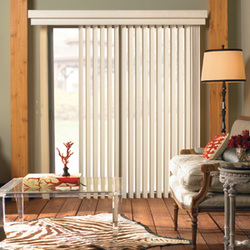
Window dressing may seem daunting but it doesn’t have to be. The easy solution is to cover every window with shades and leave it at that. Even shades or blinds can be expensive, but there is a wide selection of shades that are cost effective and good looking. In general when it comes to blinds, shades and draperies you do get what you pay for. My advice is to invest as much as you can in your window coverings. There are other areas of your project to cut back. Listed below are some tips to help with your choices.
Blinds:
Stay away from vinyl blinds. They discolor easily and only last a couple of years. Less if exposed to direct sunlight. Metal or wood blinds are much better choices, although wood blinds can be expensive. Always mount your blinds on the inside of the frame. This always looks more finished.
Shades:
The choices here are expansive, as is the price range. Choices include, fabric, grass or reed, color, and any number of exotic materials. If you are planning to add an over treatment of any kind with shades mount the shades inside the frame. With shades alone you can mount them outside the frame to give a finished look. With shades alone you also want to consider using color.
Draperies:
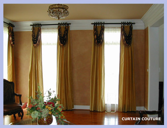
* An important point here is the hardware used to hang the draperies is a key to great window treatments.
Again the range of choices here is expansive so I am going to list some tips to consider.
1. Don’t skimp on the hardware
2. Utilize the discount retailers, even the super discount operators, to find some great looks in both hardware and pre-made draperies.
3. In general your base or neutral colors work best for draperies, but again this subjective.
4. Strike a balance between too much and not enough. This is where the style of your interior comes into play.
5. Try to use a professional installer if possible. They know all the tricks for properly hanging your treatments.
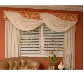
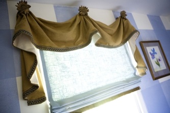
My best advice is to research the look you would like to achieve. Keep in mind that specialty top treatments and draperies utilize a lot of hidden wires, hooks, and several different types of installation tricks to get the proper hang or folds.
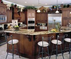
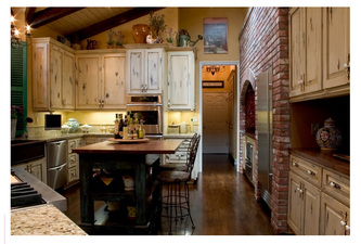
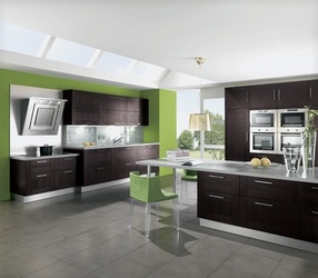
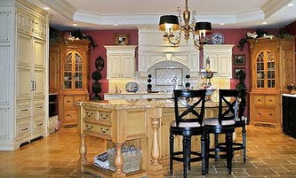
Kitchens
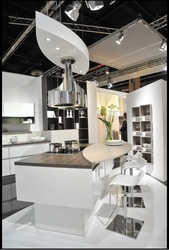
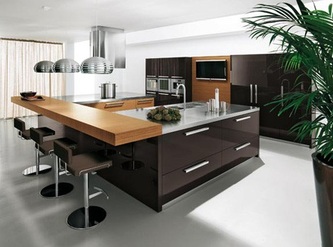
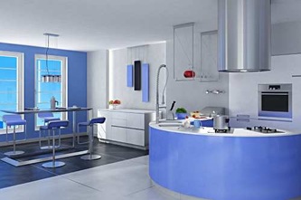
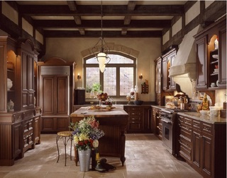
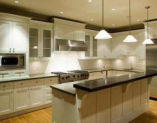
Before you start remember a kitchen is an important part of your overall design. Keep the style in line with the rest of your home.
Kitchens can be a large task. A complete remodel is an expense and time consuming project. This is an area where budgets have to be considered carefully. Whatever your budget is I suggest you add at least 20 percent to cover unexpected expenses and upgrades. Most people set a budget but find find once they start the project they come across items they want to upgrade, so plan for this. The biggest expense tends to be the cabinets and the counter tops. Listed below are some tips to help prioritize your needs so you can optimize your budget. If your budget is tight I would suggest, in this order, paint, hardware, floors, counters then fixtures.
1. Unless your cabinets are warped or not working correctly I suggest refacing or painting. New hardware can also have a dramatic effect on the look and feel. If you need to replace them start at the home improvement stores. They have the best prices on cabinets, even the special order stuff. They also have advice for the do it yourself types.
2. Counters are expensive no matter what the type. I suggest this where you should not skimp. Counters are shown to improve the value of a kitchen. They also have a dramatic effect on the space. Money spent on counters has the most effect on the style and feel of a kitchen. they can be the focal point. If you splurge on the counters you can cut corners in other places.
3. Paint goes a long way. Don't underestimate its power. Use a color from the dining room or living room to blend the spaces together.
4. If you are using hard floors in your home continue them into the kitchen. This will give continuity and help blend your overall style.
5. Plumbing and lighting fixtures. Go with the best you can. Functionality and quality matter here.
More on Color
Take the samples you collected earlier and spread them out. Now is the time to decide on base, background and accent colors. Color is personal. Never be afraid of using color. Go with your instinct. Use what you love.
Now put together your choices,
Wall colors, floor colors, base upholstery colors and accent colors.
You should start to see your scheme coming to life.
There are some basic rules that apply to design, although personal choices can always be made.
1. Neutrals and matte and or soft tones work best for walls and large upholstered pieces.
2.Bright and or heavy patterned colors are best for accent uses such as; pillows, rugs, a single wall and trim.
3. Note, black or a very dark color in some capacity is going to be important.
When building your scheme think about how much of each color you want to use. Say you like forest green as a main color. Do you want to use it as flooring? Will this be too much of this color for the space? You want a couple of main colors but you don't want them to overwhelm the overall design of your space. Balance is the key with color. You are better off with a lot of different colors in moderation than too much of a couple.
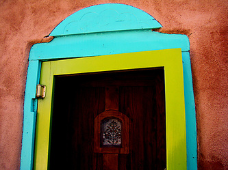
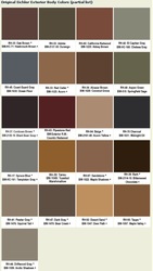
The images above show how colors of the same tone can work together.
There is a lot more on color in my blog
http//everydayinteriorcom.ipage.com/blog/
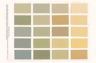
The images above show different types of neutrals
Any colors can work together as long as they are of the same tone. Keep in mind color and pattern together can make the color stand out more.
Flooring
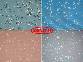
Flooring is an important background element that can have a dramatic effect on your space. Treat it as you would the walls. It is either a background or base to the overall design. The more elaborate the flooring the more of a focal point it becomes. Hard floors with area rugs can have a very dramatic effect on a room. The pros and cons of hard flooring and carpet are about even. Carpet, unless you choose a high end wool weave, requires more maintenance and replacement much more often than hard floors. Of course a hard floor is a more permanent choice. A hard floor with a wool area rug is a good middle ground. This method can be applied to all types of design styles.
Floor plans
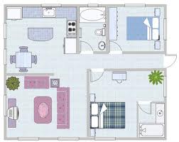
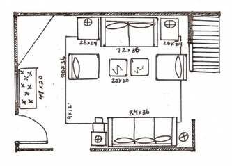
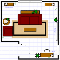
Space planning isn’t as difficult as you might think. If you want to spend time on this pick up some graph paper, pencils and a scale ruler. You can then convert all your measurements to scale and spend a lot of time drawing them out in several different configurations.
OR:
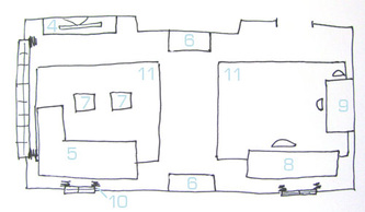
You can sketch basic outlines of your space until you get one that you like. Don’t worry about what it looks like. All you need is a idea of what and where to place the larger pieces in your space.
* This is what most designers do. A scaled floor plan is usually only used for a presentation and not for practical work.
Keep balance and symmetry in mind when putting together your floor plan.
Balance and Symmetry is basically the feel of your space. Balance does not always mean symmetry and symmetry does not always mean balance. This can be tricky and where my advice could be helpful.
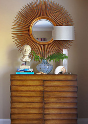
Balance:Look at the scale of your furniture and accessories. Aim for a variety of heights and bulk of pieces. The photos on the home page can give you some idea of what I mean. With furniture selection select pieces that don’t overpower your room. Select the proper scale. Leave room for walking space. If you’re dealing with a small space there will be some restriction to how many pieces you can use. In larger spaces you can give a more open feel or a more cozy feel.
Open spaces:Cozy doesn’t mean bigger items. It is better to use more items more closely spaced together.
Smaller spaces:
You can use larger pieces, just fewer of them. It is difficult to create an open feel to a small space but it can be done.
Color plays a roll in the balance and symmetry of your space as well regardless of how many colors you use.
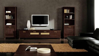
* An important thing to remember about balance is an anchor color. A dark color such as black or navy blue, I prefer black, will bring the solidity to the space. It is best used with a table, lamp, or rug. You can also use a large dark wood piece for this but keep in mind it will also become a focal point. (such as a entertainment center) Pillows don’t work for this.
Furniture
The most important thing to remember about furniture is scale.
A couple of points first:
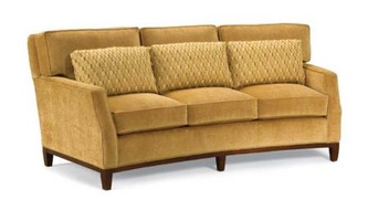
1. Try not to arrange your sofas along walls. Even in small spaces one piece can usually be floated in the room. Doing this adds more interest and creates a feeling of more space and openness.
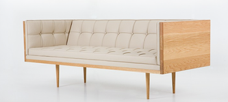
2. Sofas with legs and open style tables will also create openness.
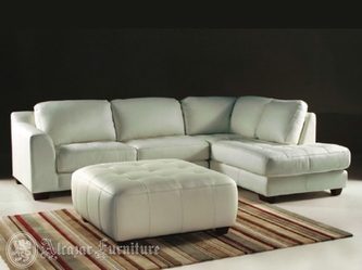
3. Be very careful with sectionals. They can take over a room and offer fewer options for arrangement.
4. Don’t be timid about mixing styles, fabrics and patterns. Just keep the scale even.
Larger Spaces:
Scale is less of a consideration in larger spaces. Remember too much is always too much. If you think it is too much chances are it is.
Larger spaces need one or two focal points to hold them together. (fireplace, entertainment center, display piece)
In spaces with high ceilings bulky pieces give some grounding to the room without bringing down the ceiling. If you are trying to pull a large space into more of a cozy feel try tall pieces to bring down the height or cluster pieces to get more intimacy.
Smaller Spaces:
Here is where you have to pay close attention to scale. Small spaces can be tricky but I have some tips for you.
If you like or need larger pieces but want a more open feel use fewer of them. When using large or bulky pieces try using chairs and/or loveseats instead of full sized sofas.
If you like a more intimate feel and don’t mind clutter do what you like. When decorating this way try to keep the accessories under control. You don’t want to create too many focal points. Speaking of focal points, coffee tables are great focal points in smaller rooms.
Lighting
Lighting plays a number of roles in your overall design plan, weather functional, task lighting, background lighting, or mood lighting.
In any giving space decide what you need. What is the function of the space? I’ll use a living room for example.
Background or Ambient Light:
Start with this.This could be light from a torchere, sconces, a ceiling fan or even back lighting in case goods. The light should be soft and even. You’re trying to create a glow but not a focal point of light.
Functional:
In a living room this would be directional lighting for artwork, a fireplace, or a featured collection of some sort. This light should be brighter then the ambient light but not too bright to draw attention to it and away from its intended purpose.
Task Lighting:
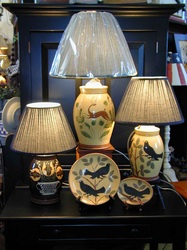
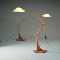
In a living room this would most likely be for reading. Table or floor lamps are the best choices for this.
Mood Lighting:
These are the little extra lamps in various places around the room for extra glow or feeling. These lamps should be low level illumination placed in various places through out a room without ant obvious pattern to the light.
Other Considerations
Woods and Metals:
Don’t be afraid to mix woods and metals. There are no rules that say all your wood or metal has to be the same. Experiment a little. Mix different woods together and see what strikes you. Do the same for metals.
Personally I like metals for accessories and lamps and woods for case goods, but a collection of wooden boxes can be a nice accent for a tabletop.
There are many other things to consider for your space. The personal touches that can add that special something that will add comfort and a sense of home.
Collections:
You know the stuff you’ve accumulated over the years that you have stashed away somewhere. Think of new ways to showcase them. Use a bookshelf, sofa table, wall space, or even floor space. Arrange them however you like but arrange them and show them off.
Family Pictures:
Pictures of your family or adventures are just the thing to add a very personal touch to your space. Go to a local hobby store and pick up a variety of frames. Arrange them in the same manner as described above.
Artwork:
This is an area of design people shy away from. Don’t be shy! Contrary to popular belief artwork does not have to “GO” with your space. The only thing I can say is very traditional art or very modern art does work better in their respective styles, but there is always a middle ground or a solution as to how to work in any type of art into any type of space. Hang what you want and what you like.
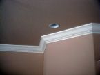
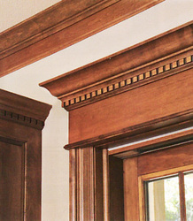
Moldings and Trim:
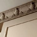
Moldings and trim are a dramatic way to increase the drama and sophistication of an interior space. They can be expensive but can be installed if you’re handy with a hammer and table saw.
Wall Coverings
A few tips on coverings and papers.
Coverings:usually fabric small to no pattern but can be textured. Used to cover full walls as an accent or paint alternative. Wainscoting and pine boarding and bullet boarding also fall into this category.
Papers: usually larger patterns, but can be simple textures, and most effectively used in bathrooms or as accent in bedrooms and kitchens. Borders generally fall into the paper category. These are also used as an accent.
With any type of wall covering be careful not to let the covering become a main focal point of the room.(exceptions: bathrooms, kitchens and bedrooms.

